Think deeper.
For those willing to question, unlearn, and build a stronger understanding.
 UNFRAGILESTRESS-FORGED
CONCEPT-DRIVEN APPAREL / HUMAN RESILIENCE
Challenges. Reversals. Failures.
They are part of your story.
The strength you build is what comes next.
01 / THE CONVICTION
HUMAN RESILIENCE, MADE VISIBLE.UNFRAGILE is built on the power of human resilience: our capacity to meet adversity, rebuild, and become stronger through the experience.
The setback. The failed attempt. The reversal you never saw coming. These moments leave a mark. They can also deepen our judgment, sharpen our purpose, and reveal strength we had yet to discover.
Growth takes work: reflection, recovery, support, and the courage to try again. We celebrate that work—and the people who carry it forward.
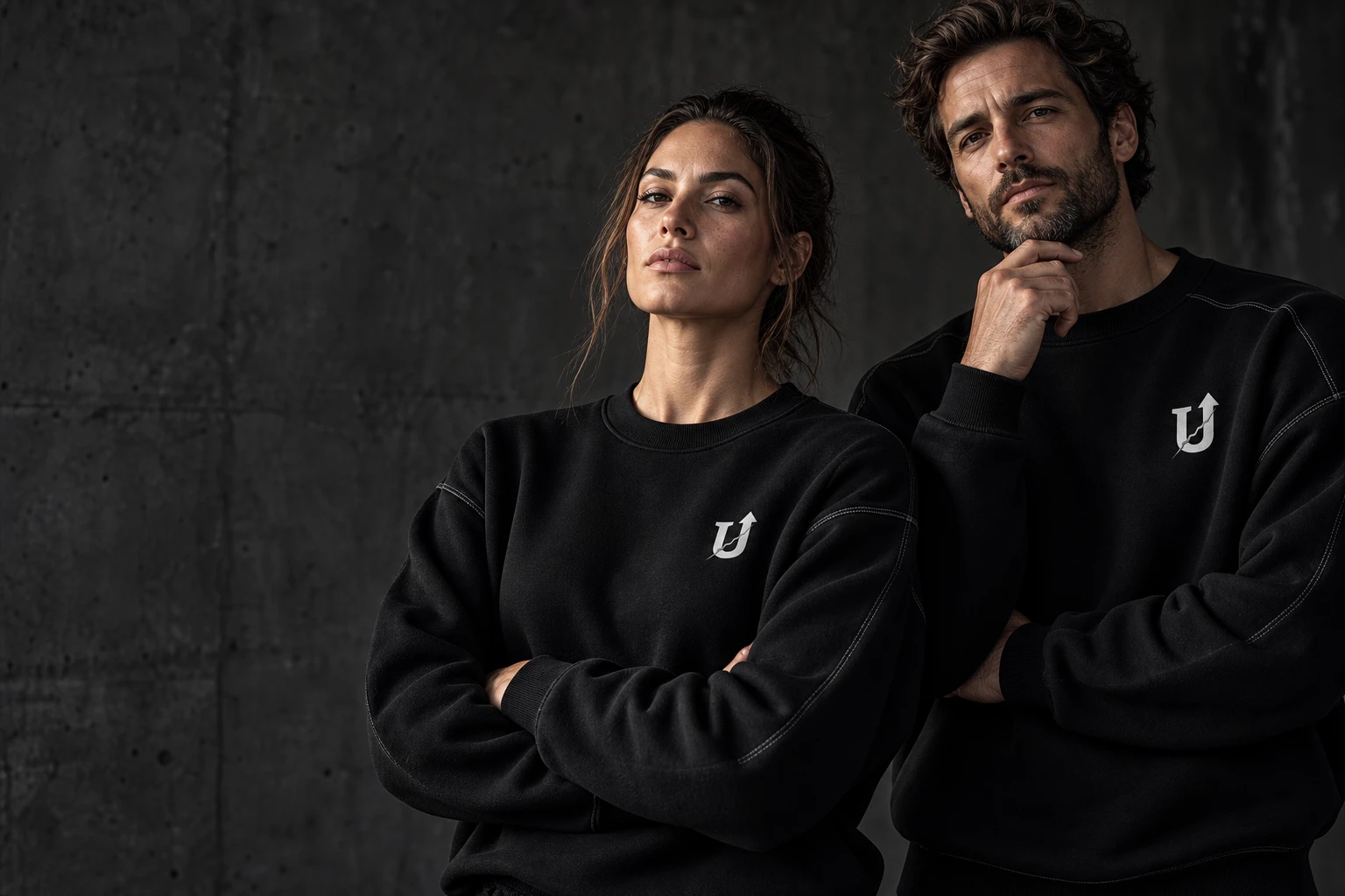
UNFRAGILE is an elite, concept-driven apparel brand for intellectuals, athletes, and creators. People committed to developing the mind, the body, and the work. Quiet in expression. Uncompromising in meaning.
Your history belongs to you.
Wear the strength you built from it.
For those willing to question, unlearn, and build a stronger understanding.
For those who return to the work with patience, discipline, and renewed purpose.
For those who turn the failed attempt into the beginning of something better.
02 / TWO IDEAS. ONE CONVICTION.
ANTIFRAGILITY × KINTSUGINassim Nicholas Taleb’s concept of antifragility describes systems that gain from disorder. Resilience helps us withstand and recover. Antifragility offers a further ambition: to adapt and grow through the challenge itself.
For UNFRAGILE, it is a conviction we bring to human life. What tests us can become material for our development. The strength is in how we respond, learn, and rebuild.
In the Japanese art of kintsugi, a broken vessel is repaired with lacquer and precious metal, often gold. The joins remain visible. The repair becomes a valued part of the object’s history and beauty.
That is the idea we carry into apparel. The silver seam honors the break and the work of repair. A visible expression of internal strength. A history worth wearing.
03 / THE MARK
ONE SYMBOL. THREE IDEAS.04 / THE COLLECTION
IN DEVELOPMENTTwo essentials.
One conviction.
Sweatshirts and T-shirts. A black foundation, a considered silhouette, and the U-arrow at the chest. The silver repair is the signature that connects them.
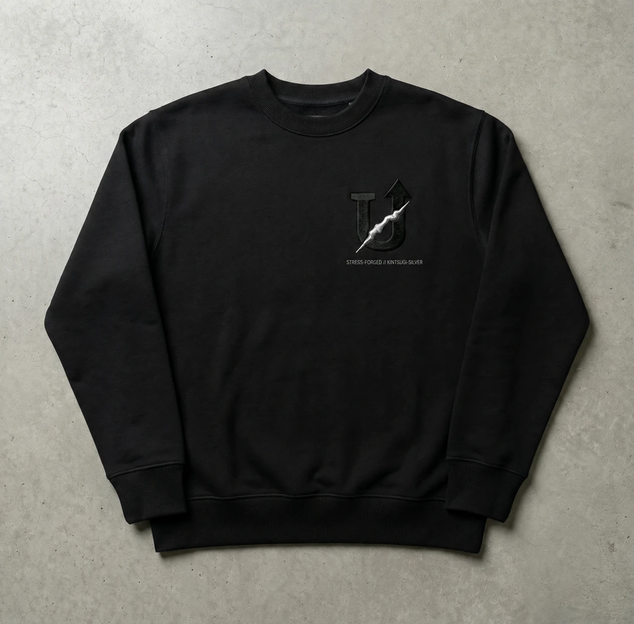
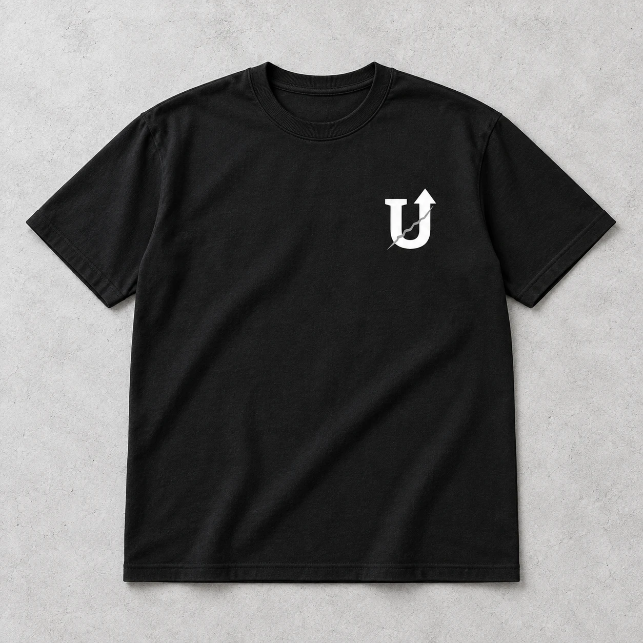
The same conviction, in its everyday form. A quiet signature for the work and life you build.
Collection imagery shows design concepts. Garments, decoration methods, finishes, and placements are being developed; products are not yet available to purchase.
05 / THE MATERIAL LANGUAGE
SAME MARK. DIFFERENT EXPRESSION.Silver is the starting point. Gold and carbon explore how the same repair can feel luminous, warm, or almost hidden.
A cool, bright seam against the black body. The foundation of the collection.
A warmer expression of the kintsugi reference. The repair becomes a point of light.
A tonal study in black and slate. Texture carries the idea with less contrast.
Material names describe the design direction. Final thread, print, and surface finishes will be defined through sampling.
06 / WORDS TO WEAR
THE NAME / THE MATERIAL / THE IDEAThe icon leads. The words add context: an interior label, a sleeve signature, or a statement across the back.


UNFRAGILE / STRESS-FORGED
For every challenge faced.
For every return to the work.
For the person you are becoming.